Deliverable 2d: Portfolio
Johan Meppelink & Thijs Weemaes
For our final portfolio delivery we hypothesized that South America and Africa are the two biggest coffee exporting continents, whereas it will be obvious that North America Europe import the most.
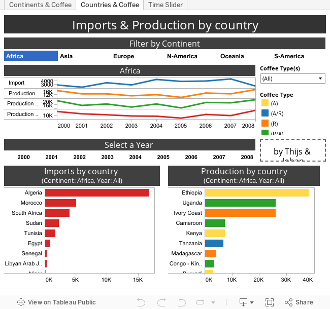
We investigated coffee import and coffee export by continent. The data was gathered from two datasets; one concerning production of coffee by leading exporters e.g. Brazil, Vietnam and Ethiopa (also coffee’s country of origin), and the other concerning its main importers. The export dataset contains amounts of coffee produced per ton over the space of eight years whereas the import dataset contained amounts of coffee imported over eight years. Coffee was divided into four different types; (A), (R), (A/R) and (R/A), we also found one unspecified cell which we coined ‘unknown.’ We only assumed that (A/R) and (R/A) are different coffee types however we could be wrong. The meaning of the letters in the dataset (R and A) are not specified and will therefore not be specified in the dashboard either: we do not know what they stand for.
We used the datasets provided, both production and import, combined them and pegged the suitable continent to each country in an additional column, or dimension. The latter allowed us to effortlessly visualize each continent as one item on the map(s) rather than a cluster of countries. Whether a continent produced or imported more is visualized in our first tab, along with additional information regarding the continents. As the two datasets varied and coffee type was unknown for the countries which imported coffee, we put ‘unknown.’ The second tab shows more detailed information concerning the import and export of countries; here the observer can find the option to narrow the (bar) charts down to continent and year by clicking on the presented filters above and below the quick line graph. The line graph in turn shows the observer information on the continent selected over the years (2000-2008). The third and final tab shows two geo-visualizations by continent and import/exporter. Both are interactive, have a time-slider and every node can be clicked on to receive further information.
By analyzing the geo-visualizations and the hard data we concluded that our hypothesis was mostly correct. South America and Asia had the highest export values, but we found that North America produces more than Africa. This is due to the fact that we incorporated Central American countries to North American continent.
When constructing the dashboard we learned a number of things. Firstly, a time-slider is convenient when it used for only one graph, or tab and not for graphs showing for example multiple years. We could not find whether we could utilize the same time-slider for two or three graphs. This was the main reason we used small tables, with year or continent, to use for filtering specific criteria. In addition, we thought it looked much better to have filters than multiple time-sliders. All by all, Tableau is a very diverse in that one is able to change each visualization to one’s liking, however, there are some limitations on how several graphs can interact.
No comments:
Post a Comment